Редакция ведущего американского портала о дизайне упаковки The Dieline опубликовала проект Violette, реализованный в рамках ребрендинга Московского завода плавленых сыров КАРАТ. Дизайн упаковки разработан брендинговым агентством Depot WPF.
Редакция ведущего американского портала о дизайне упаковки The Dieline опубликовала проект Violette, реализованный в рамках ребрендинга Московского завода плавленых сыров КАРАТ. Дизайн упаковки разработан брендинговым агентством Depot WPF.
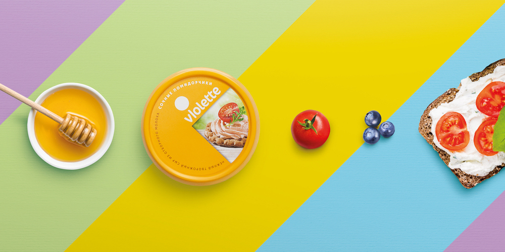
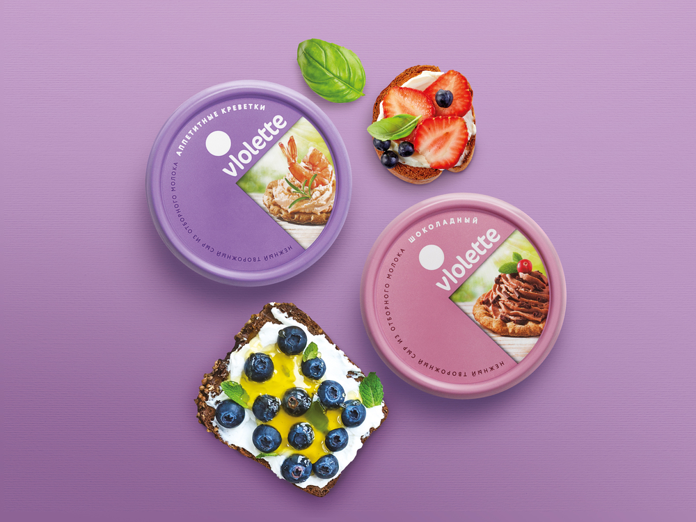
For the second time, Moscow’s cheese factory KARAT has turned to Depot WPF for new and updated packaging. They’ve turned the Violette cream cheese line into a delectable and irresistible choice, while also adding two more SKUs to the line. Violette is the newest product line under KARAT and now has seven flavors: creamy, with greens, cucumbers and greens, shrimp, chocolate, tomatoes, and mushrooms.
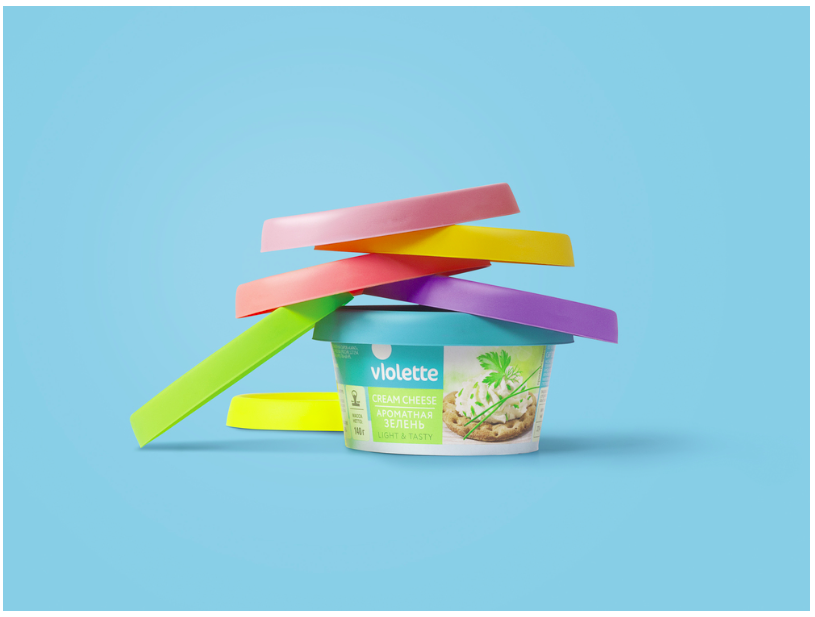
Creative director of Depot WPF Alexey Fadeev says, “The research showed us that cream cheese buyers lack emotions in its packaging design, while one doesn’t have to go over the top with freshness and naturalness, despite the fact that our competitors emphasize this. Our decision, on the one hand, meets all the requirements of the cheese category, on the other, it contains an element of playing, which certainly brings some brilliance and positive to the package. The image of Pac-man that can be read from the top of the tub is a bold move that a bold producer can afford to make.”
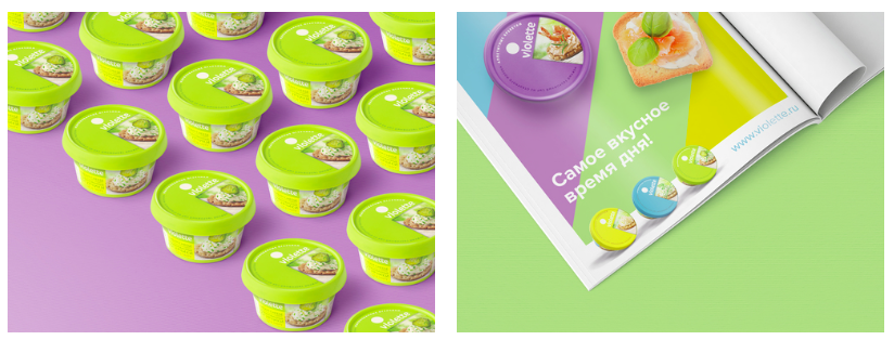
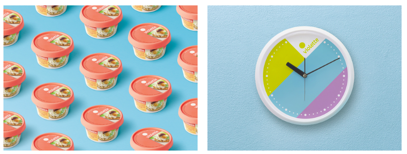
“Apart from adjusted brand platform and visual identity of Violette the shape and the packaging materials have also changed. Low-cost materials that were used before have been replaced with a combination of nice to feel high-quality plastic and cardboard. Form factor has also changed: smooth, ‘feminine’ shape prevails now. All these innovations fully comply with the positioning that was strategically built in KARAT rebranding last year: up-to-date Russian producer that can provide customers with high-quality world-class products. For the first time domestic producer has all chances to redistribute the leadership at the cream cheese market and drive out transnational competitors.”
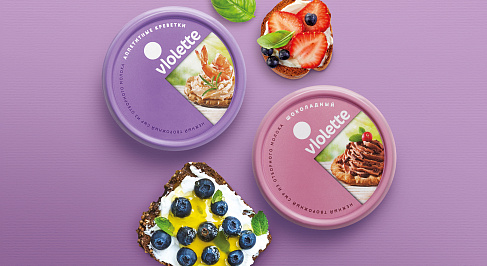
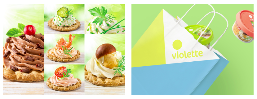
Violette is a lively and delicious-looking choice. Beautiful pastel colors and mouthwatering images of the cheeses spread on crackers make consumers instantly want to pick up the packaging to learn more. Each flavor has its own coordinating color and the picture of the final product tempt the buyers. It also gives them an idea of how to easily use Violette cream cheese, allowing them to brainstorm even more ideas and feel more excited about buying it.
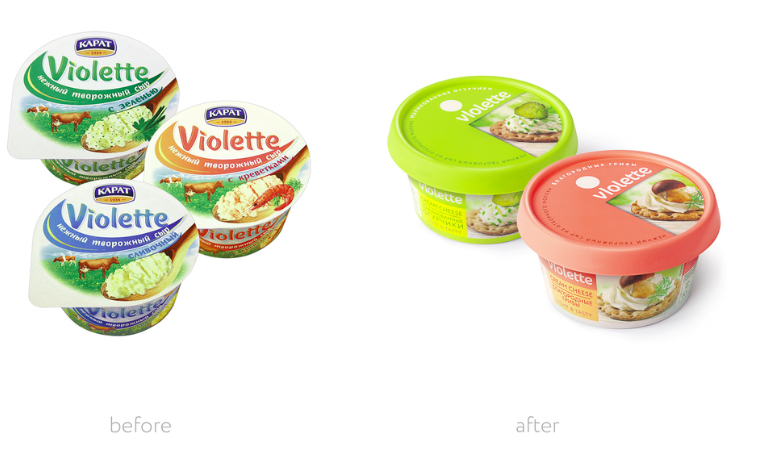
Pavel Rosenfeld, general director of Moscow factory of processed cheese KARAT, comments, “We have been working on reforming of Violette together with experts of Depot WPF branding agency for the entire last year. At the beginning of the project Violette was the main brand in the overall sales of KARAT, along with processed cheese, and #1 in sales in cream cheese category in some nationwide store chains. At the same time, we were falling behind our competitors in appearance of the package, which in customer’s perception looked more like sour cream than cheese. We decided to relaunch the trademark and offer our customers our traditionally tasty and natural cream cheese in a fundamentally different package. We plan to broaden our audience by proposing the new Violette to a new and active target audience, driving out the competitors and increasing our share to 30% in 2016.”
