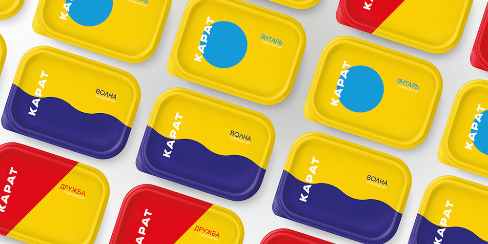
Редакция ведущего американского портала о дизайне упаковки The Dieline собрала последние проекты по разработке брендов в желтом цвете. Не остался без внимания и масштабный проект по ребрендингу завода плавленных сыров «КАРАТ», включавший обновление и корпоративного бренда, и всех торговых марок компании.
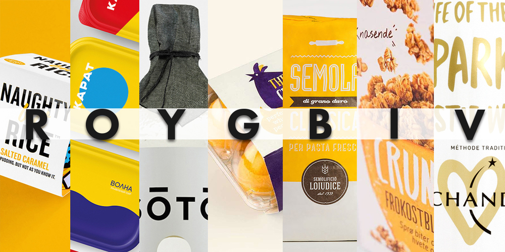
Yellow is the lightest and brightest color on the Basic Color Wheel. Usually associated with positivity and hope, the color yellow can be found not only in nature but used in media such as Sponge Bob or Tour de France winner’s jersey. This week The Dieline suggests our looking at some of the latest branding and packaging designs with this very color.
Among the other brands there is a simple and striking new cheese packaging does away with images of cow pastures and barns with a totally different approach. Using distinct lines and blocks of color, Karat cheese mixes retro inspiration with a modern and clean approach.
“Moscow factory processed cheese ‘Karat’ and for the first time in its 81-year history, the company held a large-scale rebranding and redesign of its products, which is familiar to every Russian. For updated corporate brand and packaging throughout the product line, Karat hired agency Depot WPF. The new version of ‘Karat’ abandoned Soviet-style soft cheeses - the usual globe, sweeping the letters ‘Friendship,’ retaining only the recognizable color code - red-yellow for ‘Friendship,’ blue and yellow for ‘Waves,’ turquoise and yellow for ‘Amber.’”