"Это великолепно!", - вот уже ставшая обычной реакция дизайнеров на наш последний крупный проект для бренда Dizao Organics.
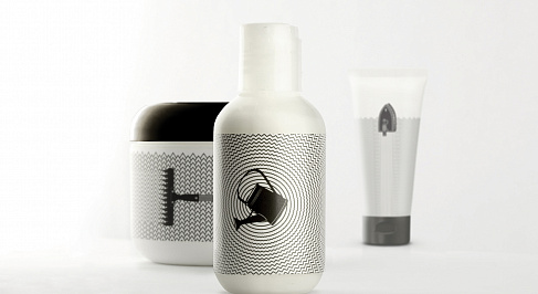
I recently came across a newly launched trendy line of organic products with simple yet classy packaging by Dizao Organics, a skin care brand from Europe. It’s targeted towards innovators. The work is done by Russia’s Depot WPF, and it’s brilliant.
It has a minimalist/modern look, with only two colours black and white, for both the actual packaging material, and the labels on them. The variation is done using a system of simple symbols which show the basic quality of each product of the range. The backdrop patterns for each product line bring out the effects of using each product. The iron straightening out wrinkles is for anti-aging. The rake signifies peeling. The watering can with smooth circles around it is for moisturising. And the broom removing the dotted pattern is for cleaning.
But where’s the other information regarding the products? They’ve broken the norm there and all that information about the producer and the method of application is placed either on the back panel of the packaging or on a label attached to it. This would make it look good and stand out on a retail shelf, due to its non-standard approach. It would also generate interest among people to pick it up and have a look around the back panel or label.
From what I’ve read on it, the main approach to sell seems to be through the internet (half of the products are to be sold online). This would make the product image/picture displayed online very appealing with its clean and simple look. The name and other relevant information would be available on the side on the page selling the product. This goes in line with the existing packaging style as well, where the detailed written information is not mixed with the visual imagery.
Each symbol does unify the product line and conveys the essence of each product in a clear and emotional way (as they wanted). The products are easily recognizable too, with or without competition around. But I would have preferred it if they had mentioned ‘Dizao’ somewhere on the front since they just launched it. While the purpose/use of the products is clear, it may be tough for a new customer (currently pretty much everyone) to identify the product/brand by name. Even existing Dizao customers for other products may miss it altogether. Also, it may be tough to leverage the associations Dizao builds with this product range onto the main brand.
Only time will tell if it can achieve cult status like the White Album (Beatles). Or the Black Album (Metallica). It’s important to note that although both these are music albums, the concept is the same. They are even more plain (one just white, the other black with a snake), and although they do not mention an album name, they do mention the artist on the front cover.
Should Dizao have atleast added its name?


